Goodbye, minimalism: How Gen Z is reshaping retail product design
We spoke to design firms, typeface companies, and brands about how to package products for Gen Z.
Starface
• 4 min read
Skincare brand Starface wants its pimple patches to feel like jewelry. The zit-zapping star stickers are packaged inside a square smiley-face compact, which the company calls “Big Yellow.” On store shelves, that smiley is nested inside an electric-lemon box, emblazoned with playful bubble letters. It’s like a cutesy matryoshka doll for acne.
“On a shelf of other acne-specific products, everything is a little drab and lackluster. So we definitely wanted to bring joy,” Starface’s president and general manager Kara Brothers-Phillips told Retail Brew.
The minimalist aesthetic that was so popular among millennials is coming to a close, and you can thank Gen Z. They look for products with attitude and personality, explained Hamish Campbell, VP executive creative director at the brand design agency Pearlfisher: “We’re now into maximalism.”
- “This is probably one of the biggest generational shifts in mindset, to be really promoting who you are,” he told us.
Pearlfisher—which works with companies like Blue Bottle Coffee, McDonald’s, Wild Turkey, and Pyrex—has noticed a growing interest in younger consumers among its clients. “Almost every brief I get is now looking to how we move these brands to be more Gen Z appropriate,” Campbell said.
When helping companies strategize and design for this audience, he emphasizes Gen Z’s creativity, mixed with their penchant for nostalgia.

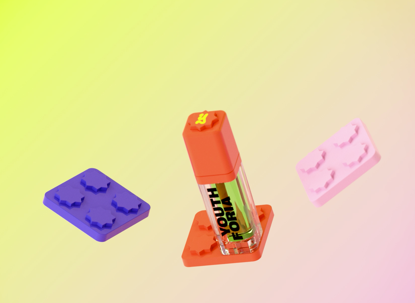
Youthforia
Beauty brand Youthforia, a Gen Z favorite, packages its lip gloss and blush in neon tubes that click together like magnetic Legos. Founder and CEO Fiona Co Chan told us she wanted the products themselves to spark childhood memories. “[It] kind of brings you back to the first time you’ve ever bought makeup…I wanted it to kind of be reminiscent of a toy.”
- Likewise, Starface believes Big Yellow’s toy-like quality adds to its social media appeal. “We imagined Big Yellow being really shareable and fun to watch,” Brothers-Phillips said.
All angles: Consumers have endless choices in the digital age, so a retailer’s packaging and logo design needs to stand out in the store and on the screen.
“The design role has grown into multiple touchpoints,” said Onur Kece, founder and creative director of the CPG beverage brand agency The Refreshment Club. “Previously, when we were designing packaged goods, it was really about walking down the aisle…They see a product, and we have to tell the whole story, make it jump out at them, and get everything in that one go.”
Retail news that keeps industry pros in the know
Retail Brew delivers the latest retail industry news and insights surrounding marketing, DTC, and e-commerce to keep leaders and decision-makers up to date.
By subscribing, you accept our Terms & Privacy Policy.
Now, he sees packaging as more of a jumping-off point for brand discovery.
“We don’t need to have the same amount of information today,” Kece explained. “To discover that journey of a product, it’s not just the packaging that’s doing the job.”
- “The whole discovery process has now become seeing your product, clicking on it, getting to their social, getting to their website.”
Screen time: Youthforia’s Chan said she designs her cosmetics with TikTok in mind, making sure the colors and fonts pop—“something that you can read if I’m holding things up, moving it through a video.”
- She and her team record videos when they receive product samples to make sure the colors translate on-screen.
In addition to shape and hue, when thinking about how a product or logo appears in the virtual world, it’s important to consider the font and lettering. Phil Garnham, senior creative type director at the century-old type design and branding agency Monotype, said a retailer’s font choice needs to feel like “it’s something that lives on screen…and it needs to be smart.”
Étienne Aubert Bonn, type designer and co-founder of the typeface foundry Coppers and Brasses, noted that fonts are coming back as a meaningful tool to represent your brand. He described the typeface of the moment as “expressive,” “flashy,” and “anything with super high contrast, really tight spacing, weird proportions, or flowy 70s psychedelic shapes.”
- Monotype’s 2022 trends report points to loopy words, balloon letters, and mismatched typefaces.
But, Bonn says, context is key. “If you’re a pharmaceutical company, you don’t really want to go too funky because then you lose credibility,” he told us.
So while Starface boasts a bold look, Brothers-Phillips emphasized the importance of a legible logo. So did Youthforia, which created two versions: one for online and one for packaging. Its digital logo is a horizontal spelling of the company name and, therefore, easier to read on a screen. Meanwhile, its packaging uses a bubbly graffiti-style font.
“Cosmetics are typically very minimalist…skinny fonts, very refined,” Chan told us. “I just wanted something that visually looks different.”
Retail news that keeps industry pros in the know
Retail Brew delivers the latest retail industry news and insights surrounding marketing, DTC, and e-commerce to keep leaders and decision-makers up to date.
By subscribing, you accept our Terms & Privacy Policy.